Graphics including GenomeDiagram
The Bio.Graphics module depends on the third party Python library
ReportLab. Although focused on
producing PDF files, ReportLab can also create encapsulated postscript
(EPS) and (SVG) files. In addition to these vector based images,
provided certain further dependencies such as the Python Imaging
Library (PIL) are
installed, ReportLab can also output bitmap images (including JPEG, PNG,
GIF, BMP and PICT formats).
GenomeDiagram
Introduction
The Bio.Graphics.GenomeDiagram module was added to Biopython 1.50,
having previously been available as a separate Python module dependent
on Biopython. GenomeDiagram is described in the Bioinformatics journal
publication by Pritchard et al. (2006)
[Pritchard2006], which includes some examples images.
There is a PDF copy of the old manual here,
http://biopython.org/DIST/docs/GenomeDiagram/userguide.pdf which has
some more examples.
As the name might suggest, GenomeDiagram was designed for drawing whole genomes, in particular prokaryotic genomes, either as linear diagrams (optionally broken up into fragments to fit better) or as circular wheel diagrams. Have a look at Figure 2 in Toth et al. (2006) [Toth2006] for a good example. It proved also well suited to drawing quite detailed figures for smaller genomes such as phage, plasmids or mitochondria, for example see Figures 1 and 2 in Van der Auwera et al. (2009) [Vanderauwera2009] (shown with additional manual editing).
This module is easiest to use if you have your genome loaded as a
SeqRecord object containing lots of SeqFeature objects - for
example as loaded from a GenBank file (see
Chapters Sequence annotation objects
and Sequence Input/Output).
Diagrams, tracks, feature-sets and features
GenomeDiagram uses a nested set of objects. At the top level, you have a diagram object representing a sequence (or sequence region) along the horizontal axis (or circle). A diagram can contain one or more tracks, shown stacked vertically (or radially on circular diagrams). These will typically all have the same length and represent the same sequence region. You might use one track to show the gene locations, another to show regulatory regions, and a third track to show the GC percentage.
The most commonly used type of track will contain features, bundled together in feature-sets. You might choose to use one feature-set for all your CDS features, and another for tRNA features. This isn’t required - they can all go in the same feature-set, but it makes it easier to update the properties of just selected features (e.g. make all the tRNA features red).
There are two main ways to build up a complete diagram. Firstly, the top down approach where you create a diagram object, and then using its methods add track(s), and use the track methods to add feature-set(s), and use their methods to add the features. Secondly, you can create the individual objects separately (in whatever order suits your code), and then combine them.
A top down example
We’re going to draw a whole genome from a SeqRecord object read in
from a GenBank file (see Chapter Sequence Input/Output).
This example uses the pPCP1 plasmid from Yersinia pestis biovar
Microtus, the file is included with the Biopython unit tests under the
GenBank folder, or online
NC_005816.gb
from our website.
from reportlab.lib import colors
from reportlab.lib.units import cm
from Bio.Graphics import GenomeDiagram
from Bio import SeqIO

record = SeqIO.read("NC_005816.gb", "genbank")
We’re using a top down approach, so after loading in our sequence we next create an empty diagram, then add an (empty) track, and to that add an (empty) feature set:
gd_diagram = GenomeDiagram.Diagram("Yersinia pestis biovar Microtus plasmid pPCP1")
gd_track_for_features = gd_diagram.new_track(1, name="Annotated Features")
gd_feature_set = gd_track_for_features.new_set()
Now the fun part - we take each gene SeqFeature object in our
SeqRecord, and use it to generate a feature on the diagram. We’re
going to color them blue, alternating between a dark blue and a light
blue.
for feature in record.features:
    if feature.type != "gene":
        # Exclude this feature
        continue
    if len(gd_feature_set) % 2 == 0:
        color = colors.blue
    else:
        color = colors.lightblue
    gd_feature_set.add_feature(feature, color=color, label=True)
Now we come to actually making the output file. This happens in two
steps, first we call the draw method, which creates all the shapes
using ReportLab objects. Then we call the write method which renders
these to the requested file format. Note you can output in multiple file
formats:
gd_diagram.draw(
    format="linear",
    orientation="landscape",
    pagesize="A4",
    fragments=4,
    start=0,
    end=len(record),
)
gd_diagram.write("plasmid_linear.pdf", "PDF")
gd_diagram.write("plasmid_linear.eps", "EPS")
gd_diagram.write("plasmid_linear.svg", "SVG")
Also, provided you have the dependencies installed, you can also do bitmaps, for example:
gd_diagram.write("plasmid_linear.png", "PNG")
The expected output is shown in Fig. 9.
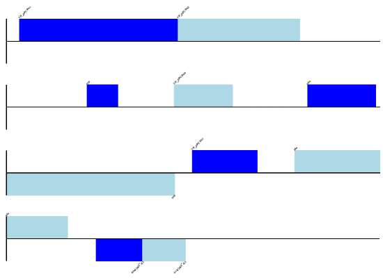
Fig. 9 Simple linear diagram for Y. pestis biovar Microtus plasmid pPCP1.
Notice that the fragments argument which we set to four controls how
many pieces the genome gets broken up into.
If you want to do a circular figure, then try this:
gd_diagram.draw(
    format="circular",
    circular=True,
    pagesize=(20 * cm, 20 * cm),
    start=0,
    end=len(record),
    circle_core=0.7,
)
gd_diagram.write("plasmid_circular.pdf", "PDF")
The expected output is shown in Fig. 10.
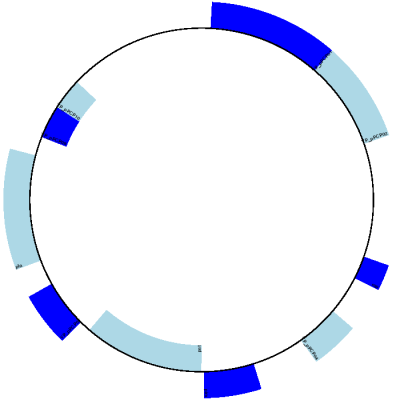
Fig. 10 Simple circular diagram for Y. pestis biovar Microtus plasmid pPCP1.
These figures are not very exciting, but we’ve only just got started.
A bottom up example
Now let’s produce exactly the same figures, but using the bottom up approach. This means we create the different objects directly (and this can be done in almost any order) and then combine them.
from reportlab.lib import colors
from reportlab.lib.units import cm
from Bio.Graphics import GenomeDiagram
from Bio import SeqIO

record = SeqIO.read("NC_005816.gb", "genbank")

# Create the feature set and its feature objects,
gd_feature_set = GenomeDiagram.FeatureSet()
for feature in record.features:
    if feature.type != "gene":
        # Exclude this feature
        continue
    if len(gd_feature_set) % 2 == 0:
        color = colors.blue
    else:
        color = colors.lightblue
    gd_feature_set.add_feature(feature, color=color, label=True)
# (this for loop is the same as in the previous example)

# Create a track, and a diagram
gd_track_for_features = GenomeDiagram.Track(name="Annotated Features")
gd_diagram = GenomeDiagram.Diagram("Yersinia pestis biovar Microtus plasmid pPCP1")

# Now have to glue the bits together...
gd_track_for_features.add_set(gd_feature_set)
gd_diagram.add_track(gd_track_for_features, 1)
You can now call the draw and write methods as before to produce
a linear or circular diagram, using the code at the end of the top-down
example above. The figures should be identical.
Features without a SeqFeature
In the above example we used a SeqRecord’s SeqFeature objects
to build our diagram (see also
Section Feature, location and position objects). Sometimes you won’t
have SeqFeature objects, but just the coordinates for a feature you
want to draw. You have to create minimal SeqFeature object, but this
is easy:
from Bio.SeqFeature import SeqFeature, SimpleLocation

my_seq_feature = SeqFeature(SimpleLocation(50, 100, strand=+1))
For strand, use +1 for the forward strand, -1 for the reverse
strand, and None for both. Here is a short self contained example:
from Bio.SeqFeature import SeqFeature, SimpleLocation
from Bio.Graphics import GenomeDiagram
from reportlab.lib.units import cm

gdd = GenomeDiagram.Diagram("Test Diagram")
gdt_features = gdd.new_track(1, greytrack=False)
gds_features = gdt_features.new_set()

# Add three features to show the strand options,
feature = SeqFeature(SimpleLocation(25, 125, strand=+1))
gds_features.add_feature(feature, name="Forward", label=True)
feature = SeqFeature(SimpleLocation(150, 250, strand=None))
gds_features.add_feature(feature, name="Strandless", label=True)
feature = SeqFeature(SimpleLocation(275, 375, strand=-1))
gds_features.add_feature(feature, name="Reverse", label=True)

gdd.draw(format="linear", pagesize=(15 * cm, 4 * cm), fragments=1, start=0, end=400)
gdd.write("GD_labels_default.pdf", "pdf")
The output is shown at the top of Fig. 11 (in the default feature color, pale green).
Notice that we have used the name argument here to specify the
caption text for these features. This is discussed in more detail next.
Feature captions
Recall we used the following (where feature was a SeqFeature
object) to add a feature to the diagram:
gd_feature_set.add_feature(feature, color=color, label=True)
In the example above the SeqFeature annotation was used to pick a
sensible caption for the features. By default the following possible
entries under the SeqFeature object’s qualifiers dictionary are
used: gene, label, name, locus_tag, and product.
More simply, you can specify a name directly:
gd_feature_set.add_feature(feature, color=color, label=True, name="My Gene")
In addition to the caption text for each feature’s label, you can also choose the font, position (this defaults to the start of the sigil, you can also choose the middle or at the end) and orientation (for linear diagrams only, where this defaults to rotated by \(45\) degrees):
# Large font, parallel with the track
gd_feature_set.add_feature(
    feature, label=True, color="green", label_size=25, label_angle=0
)

# Very small font, perpendicular to the track (towards it)
gd_feature_set.add_feature(
    feature,
    label=True,
    color="purple",
    label_position="end",
    label_size=4,
    label_angle=90,
)

# Small font, perpendicular to the track (away from it)
gd_feature_set.add_feature(
    feature,
    label=True,
    color="blue",
    label_position="middle",
    label_size=6,
    label_angle=-90,
)
Combining each of these three fragments with the complete example in the previous section should give something like the tracks in Fig. 11.
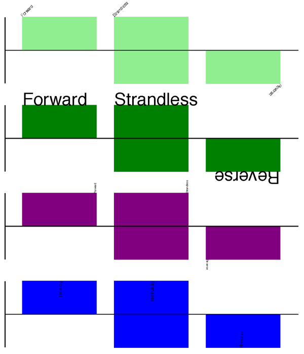
Fig. 11 Simple GenomeDiagram showing label options.
The top plot in pale green shows the default label settings (see Section Features without a SeqFeature) while the rest show variations in the label size, position and orientation (see Section Feature captions).
We’ve not shown it here, but you can also set label_color to control
the label’s color (used in Section A nice example).
You’ll notice the default font is quite small - this makes sense because you will usually be drawing many (small) features on a page, not just a few large ones as shown here.
Feature sigils
The examples above have all just used the default sigil for the feature, a plain box, which was all that was available in the last publicly released standalone version of GenomeDiagram. Arrow sigils were included when GenomeDiagram was added to Biopython 1.50:
# Default uses a BOX sigil
gd_feature_set.add_feature(feature)

# You can make this explicit:
gd_feature_set.add_feature(feature, sigil="BOX")

# Or opt for an arrow:
gd_feature_set.add_feature(feature, sigil="ARROW")
Biopython 1.61 added three more sigils,
# Box with corners cut off (making it an octagon)
gd_feature_set.add_feature(feature, sigil="OCTO")

# Box with jagged edges (useful for showing breaks in contains)
gd_feature_set.add_feature(feature, sigil="JAGGY")

# Arrow which spans the axis with strand used only for direction
gd_feature_set.add_feature(feature, sigil="BIGARROW")
These are shown in Fig. 12. Most sigils fit into a bounding box (as given by the default BOX sigil), either above or below the axis for the forward or reverse strand, or straddling it (double the height) for strand-less features. The BIGARROW sigil is different, always straddling the axis with the direction taken from the feature’s stand.
Fig. 12 Simple GenomeDiagram showing different sigils.
Arrow sigils
We introduced the arrow sigils in the previous section. There are two additional options to adjust the shapes of the arrows, firstly the thickness of the arrow shaft, given as a proportion of the height of the bounding box:
# Full height shafts, giving pointed boxes:
gd_feature_set.add_feature(feature, sigil="ARROW", color="brown", arrowshaft_height=1.0)
# Or, thin shafts:
gd_feature_set.add_feature(feature, sigil="ARROW", color="teal", arrowshaft_height=0.2)
# Or, very thin shafts:
gd_feature_set.add_feature(
    feature, sigil="ARROW", color="darkgreen", arrowshaft_height=0.1
)
The results are shown in Fig. 13.
Fig. 13 Simple GenomeDiagram showing arrow shaft options.
Secondly, the length of the arrow head - given as a proportion of the height of the bounding box (defaulting to \(0.5\), or \(50\%\)):
# Short arrow heads:
gd_feature_set.add_feature(feature, sigil="ARROW", color="blue", arrowhead_length=0.25)
# Or, longer arrow heads:
gd_feature_set.add_feature(feature, sigil="ARROW", color="orange", arrowhead_length=1)
# Or, very very long arrow heads (i.e. all head, no shaft, so triangles):
gd_feature_set.add_feature(feature, sigil="ARROW", color="red", arrowhead_length=10000)
The results are shown in Fig. 14.
Fig. 14 Simple GenomeDiagram showing arrow head options.
Biopython 1.61 adds a new BIGARROW sigil which always straddles the
axis, pointing left for the reverse strand or right otherwise:
# A large arrow straddling the axis:
gd_feature_set.add_feature(feature, sigil="BIGARROW")
All the shaft and arrow head options shown above for the ARROW sigil
can be used for the BIGARROW sigil too.
A nice example
Now let’s return to the pPCP1 plasmid from Yersinia pestis biovar Microtus, and the top down approach used in Section A top down example, but take advantage of the sigil options we’ve now discussed. This time we’ll use arrows for the genes, and overlay them with strand-less features (as plain boxes) showing the position of some restriction digest sites.
from reportlab.lib import colors
from reportlab.lib.units import cm
from Bio.Graphics import GenomeDiagram
from Bio import SeqIO
from Bio.SeqFeature import SeqFeature, SimpleLocation

record = SeqIO.read("NC_005816.gb", "genbank")

gd_diagram = GenomeDiagram.Diagram(record.id)
gd_track_for_features = gd_diagram.new_track(1, name="Annotated Features")
gd_feature_set = gd_track_for_features.new_set()

for feature in record.features:
    if feature.type != "gene":
        # Exclude this feature
        continue
    if len(gd_feature_set) % 2 == 0:
        color = colors.blue
    else:
        color = colors.lightblue
    gd_feature_set.add_feature(
        feature, sigil="ARROW", color=color, label=True, label_size=14, label_angle=0
    )

# I want to include some strandless features, so for an example
# will use EcoRI recognition sites etc.
for site, name, color in [
    ("GAATTC", "EcoRI", colors.green),
    ("CCCGGG", "SmaI", colors.orange),
    ("AAGCTT", "HindIII", colors.red),
    ("GGATCC", "BamHI", colors.purple),
]:
    index = 0
    while True:
        index = record.seq.find(site, start=index)
        if index == -1:
            break
        feature = SeqFeature(SimpleLocation(index, index + len(site)))
        gd_feature_set.add_feature(
            feature,
            color=color,
            name=name,
            label=True,
            label_size=10,
            label_color=color,
        )
        index += len(site)

gd_diagram.draw(format="linear", pagesize="A4", fragments=4, start=0, end=len(record))
gd_diagram.write("plasmid_linear_nice.pdf", "PDF")
gd_diagram.write("plasmid_linear_nice.eps", "EPS")
gd_diagram.write("plasmid_linear_nice.svg", "SVG")

gd_diagram.draw(
    format="circular",
    circular=True,
    pagesize=(20 * cm, 20 * cm),
    start=0,
    end=len(record),
    circle_core=0.5,
)
gd_diagram.write("plasmid_circular_nice.pdf", "PDF")
gd_diagram.write("plasmid_circular_nice.eps", "EPS")
gd_diagram.write("plasmid_circular_nice.svg", "SVG")
The expected output is shown in Figures Linear diagram for plasmid pPCP1 showing selected restriction digest sites. and Circular diagram for plasmid pPCP1 showing selected restriction digest sites ..
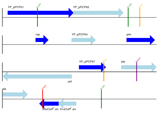
Fig. 15 Linear diagram for plasmid pPCP1 showing selected restriction digest sites.
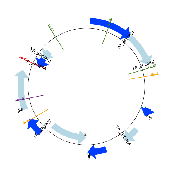
Fig. 16 Circular diagram for plasmid pPCP1 showing selected restriction digest sites .
Multiple tracks
All the examples so far have used a single track, but you can have more than one track – for example show the genes on one, and repeat regions on another. In this example we’re going to show three phage genomes side by side to scale, inspired by Figure 6 in Proux et al. (2002) [Proux2002]. We’ll need the GenBank files for the following three phage:
NC_002703– Lactococcus phage Tuc2009, complete genome (\(38347\) bp)AF323668– Bacteriophage bIL285, complete genome (\(35538\) bp)NC_003212– Listeria innocua Clip11262, complete genome, of which we are focussing only on integrated prophage 5 (similar length).
You can download these using Entrez if you like, see Section EFetch: Downloading full records from Entrez for more details. For the third record we’ve worked out where the phage is integrated into the genome, and slice the record to extract it (with the features preserved, see Section Slicing a SeqRecord), and must also reverse complement to match the orientation of the first two phage (again preserving the features, see Section Reverse-complementing SeqRecord objects):
from Bio import SeqIO

A_rec = SeqIO.read("NC_002703.gbk", "gb")
B_rec = SeqIO.read("AF323668.gbk", "gb")
C_rec = SeqIO.read("NC_003212.gbk", "gb")[2587879:2625807].reverse_complement(name=True)
The figure we are imitating used different colors for different gene functions. One way to do this is to edit the GenBank file to record color preferences for each feature - something Sanger’s Artemis editor does, and which GenomeDiagram should understand. Here however, we’ll just hard code three lists of colors.
Note that the annotation in the GenBank files doesn’t exactly match that shown in Proux et al., they have drawn some unannotated genes.
from reportlab.lib.colors import (
    red,
    grey,
    orange,
    green,
    brown,
    blue,
    lightblue,
    purple,
)

A_colors = (
    [red] * 5
    + [grey] * 7
    + [orange] * 2
    + [grey] * 2
    + [orange]
    + [grey] * 11
    + [green] * 4
    + [grey]
    + [green] * 2
    + [grey, green]
    + [brown] * 5
    + [blue] * 4
    + [lightblue] * 5
    + [grey, lightblue]
    + [purple] * 2
    + [grey]
)
B_colors = (
    [red] * 6
    + [grey] * 8
    + [orange] * 2
    + [grey]
    + [orange]
    + [grey] * 21
    + [green] * 5
    + [grey]
    + [brown] * 4
    + [blue] * 3
    + [lightblue] * 3
    + [grey] * 5
    + [purple] * 2
)
C_colors = (
    [grey] * 30
    + [green] * 5
    + [brown] * 4
    + [blue] * 2
    + [grey, blue]
    + [lightblue] * 2
    + [grey] * 5
)
Now to draw them – this time we add three tracks to the diagram, and also notice they are given different start/end values to reflect their different lengths (this requires Biopython 1.59 or later).
from Bio.Graphics import GenomeDiagram

name = "Proux Fig 6"
gd_diagram = GenomeDiagram.Diagram(name)
max_len = 0
for record, gene_colors in zip([A_rec, B_rec, C_rec], [A_colors, B_colors, C_colors]):
    max_len = max(max_len, len(record))
    gd_track_for_features = gd_diagram.new_track(
        1, name=record.name, greytrack=True, start=0, end=len(record)
    )
    gd_feature_set = gd_track_for_features.new_set()

    i = 0
    for feature in record.features:
        if feature.type != "gene":
            # Exclude this feature
            continue
        gd_feature_set.add_feature(
            feature,
            sigil="ARROW",
            color=gene_colors[i],
            label=True,
            name=str(i + 1),
            label_position="start",
            label_size=6,
            label_angle=0,
        )
        i += 1

gd_diagram.draw(format="linear", pagesize="A4", fragments=1, start=0, end=max_len)
gd_diagram.write(name + ".pdf", "PDF")
gd_diagram.write(name + ".eps", "EPS")
gd_diagram.write(name + ".svg", "SVG")
The expected output is shown in Fig. 17.
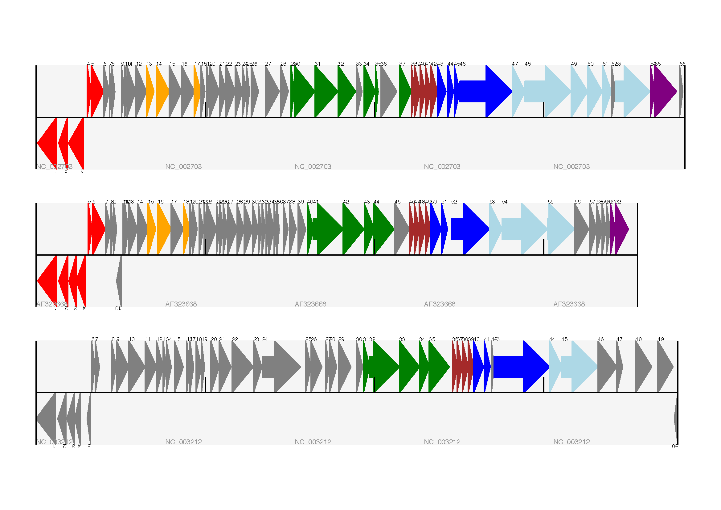
Fig. 17 Linear diagram with three tracks for three phages.
This shows Lactococcus phage Tuc2009 (NC_002703), bacteriophage bIL285 (AF323668), and prophage 5 from Listeria innocua Clip11262 (NC_003212) (see Section Multiple tracks).
I did wonder why in the original manuscript there were no red or orange genes marked in the bottom phage. Another important point is here the phage are shown with different lengths - this is because they are all drawn to the same scale (they are different lengths).
The key difference from the published figure is they have color-coded links between similar proteins – which is what we will do in the next section.
Cross-Links between tracks
Biopython 1.59 added the ability to draw cross links between tracks - both simple linear diagrams as we will show here, but also linear diagrams split into fragments and circular diagrams.
Continuing the example from the previous section inspired by Figure 6 from Proux et al. 2002 [Proux2002], we would need a list of cross links between pairs of genes, along with a score or color to use. Realistically you might extract this from a BLAST file computationally, but here I have manually typed them in.
My naming convention continues to refer to the three phage as A, B and C. Here are the links we want to show between A and B, given as a list of tuples (percentage similarity score, gene in A, gene in B).
# Tuc2009 (NC_002703) vs bIL285 (AF323668)
A_vs_B = [
    (99, "Tuc2009_01", "int"),
    (33, "Tuc2009_03", "orf4"),
    (94, "Tuc2009_05", "orf6"),
    (100, "Tuc2009_06", "orf7"),
    (97, "Tuc2009_07", "orf8"),
    (98, "Tuc2009_08", "orf9"),
    (98, "Tuc2009_09", "orf10"),
    (100, "Tuc2009_10", "orf12"),
    (100, "Tuc2009_11", "orf13"),
    (94, "Tuc2009_12", "orf14"),
    (87, "Tuc2009_13", "orf15"),
    (94, "Tuc2009_14", "orf16"),
    (94, "Tuc2009_15", "orf17"),
    (88, "Tuc2009_17", "rusA"),
    (91, "Tuc2009_18", "orf20"),
    (93, "Tuc2009_19", "orf22"),
    (71, "Tuc2009_20", "orf23"),
    (51, "Tuc2009_22", "orf27"),
    (97, "Tuc2009_23", "orf28"),
    (88, "Tuc2009_24", "orf29"),
    (26, "Tuc2009_26", "orf38"),
    (19, "Tuc2009_46", "orf52"),
    (77, "Tuc2009_48", "orf54"),
    (91, "Tuc2009_49", "orf55"),
    (95, "Tuc2009_52", "orf60"),
]
Likewise for B and C:
# bIL285 (AF323668) vs Listeria innocua prophage 5 (in NC_003212)
B_vs_C = [
    (42, "orf39", "lin2581"),
    (31, "orf40", "lin2580"),
    (49, "orf41", "lin2579"),  # terL
    (54, "orf42", "lin2578"),  # portal
    (55, "orf43", "lin2577"),  # protease
    (33, "orf44", "lin2576"),  # mhp
    (51, "orf46", "lin2575"),
    (33, "orf47", "lin2574"),
    (40, "orf48", "lin2573"),
    (25, "orf49", "lin2572"),
    (50, "orf50", "lin2571"),
    (48, "orf51", "lin2570"),
    (24, "orf52", "lin2568"),
    (30, "orf53", "lin2567"),
    (28, "orf54", "lin2566"),
]
For the first and last phage these identifiers are locus tags, for the middle phage there are no locus tags so I’ve used gene names instead. The following little helper function lets us lookup a feature using either a locus tag or gene name:
def get_feature(features, id, tags=["locus_tag", "gene"]):
    """Search list of SeqFeature objects for an identifier under the given tags."""
    for f in features:
        for key in tags:
            # tag may not be present in this feature
            for x in f.qualifiers.get(key, []):
                if x == id:
                    return f
    raise KeyError(id)
We can now turn those list of identifier pairs into SeqFeature pairs,
and thus find their location coordinates. We can now add all that code
and the following snippet to the previous example (just before the
gd_diagram.draw(...) line – see the finished example script
Proux_et_al_2002_Figure_6.py
included in the Doc/examples folder of the Biopython source code) to
add cross links to the figure:
from Bio.Graphics.GenomeDiagram import CrossLink
from reportlab.lib import colors

# Note it might have been clearer to assign the track numbers explicitly...
for rec_X, tn_X, rec_Y, tn_Y, X_vs_Y in [
    (A_rec, 3, B_rec, 2, A_vs_B),
    (B_rec, 2, C_rec, 1, B_vs_C),
]:
    track_X = gd_diagram.tracks[tn_X]
    track_Y = gd_diagram.tracks[tn_Y]
    for score, id_X, id_Y in X_vs_Y:
        feature_X = get_feature(rec_X.features, id_X)
        feature_Y = get_feature(rec_Y.features, id_Y)
        color = colors.linearlyInterpolatedColor(
            colors.white, colors.firebrick, 0, 100, score
        )
        link_xy = CrossLink(
            (track_X, feature_X.location.start, feature_X.location.end),
            (track_Y, feature_Y.location.start, feature_Y.location.end),
            color,
            colors.lightgrey,
        )
        gd_diagram.cross_track_links.append(link_xy)
There are several important pieces to this code. First the
GenomeDiagram object has a cross_track_links attribute which is
just a list of CrossLink objects. Each CrossLink object takes
two sets of track-specific coordinates (here given as tuples, you can
alternatively use a GenomeDiagram.Feature object instead). You can
optionally supply a color, border color, and say if this link should be
drawn flipped (useful for showing inversions).
You can also see how we turn the BLAST percentage identity score into a color, interpolating between white (\(0\%\)) and a dark red (\(100\%\)). In this example we don’t have any problems with overlapping cross-links. One way to tackle that is to use transparency in ReportLab, by using colors with their alpha channel set. However, this kind of shaded color scheme combined with overlap transparency would be difficult to interpret. The expected output is shown in Fig. 18.
Fig. 18 Linear diagram with three tracks plus basic cross-links.
The three tracks show Lactococcus phage Tuc2009 (NC_002703), bacteriophage bIL285 (AF323668), and prophage 5 from Listeria innocua Clip11262 (NC_003212) plus basic cross-links shaded by percentage identity (see Section Cross-Links between tracks).
There is still a lot more that can be done within Biopython to help
improve this figure. First of all, the cross links in this case are
between proteins which are drawn in a strand specific manor. It can help
to add a background region (a feature using the ‘BOX’ sigil) on the
feature track to extend the cross link. Also, we could reduce the
vertical height of the feature tracks to allocate more to the links
instead – one way to do that is to allocate space for empty tracks.
Furthermore, in cases like this where there are no large gene overlaps,
we can use the axis-straddling BIGARROW sigil, which allows us to
further reduce the vertical space needed for the track. These
improvements are demonstrated in the example script
Proux_et_al_2002_Figure_6.py
included in the Doc/examples folder of the Biopython source code.
The expected output is shown in Fig. 19.
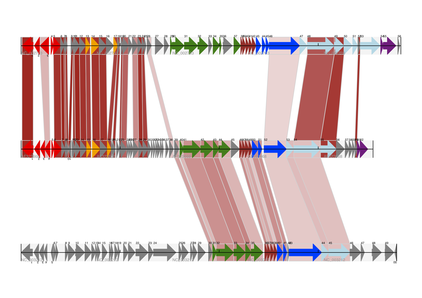
Fig. 19 Linear diagram with three tracks plus shaded cross-links.
The three tracks show Lactococcus phage Tuc2009 (NC_002703), bacteriophage bIL285 (AF323668), and prophage 5 from Listeria innocua Clip11262 (NC_003212) plus cross-links shaded by percentage identity (see Section Cross-Links between tracks).
Beyond that, finishing touches you might want to do manually in a vector image editor include fine tuning the placement of gene labels, and adding other custom annotation such as highlighting particular regions.
Although not really necessary in this example since none of the cross-links overlap, using a transparent color in ReportLab is a very useful technique for superimposing multiple links. However, in this case a shaded color scheme should be avoided.
Further options
You can control the tick marks to show the scale – after all every graph should show its units, and the number of the grey-track labels.
Also, we have only used the FeatureSet so far. GenomeDiagram also
has a GraphSet which can be used for show line graphs, bar charts
and heat plots (e.g. to show plots of GC% on a track parallel to the
features).
These options are not covered here yet, so for now we refer you to the User Guide (PDF) included with the standalone version of GenomeDiagram (but please read the next section first), and the docstrings.
Converting old code
If you have old code written using the standalone version of GenomeDiagram, and you want to switch it over to using the new version included with Biopython then you will have to make a few changes - most importantly to your import statements.
Also, the older version of GenomeDiagram used only the UK spellings of color and center (colour and centre). You will need to change to the American spellings, although for several years the Biopython version of GenomeDiagram supported both.
For example, if you used to have:
from GenomeDiagram import GDFeatureSet, GDDiagram

gdd = GDDiagram("An example")
...
you could just switch the import statements like this:
from Bio.Graphics.GenomeDiagram import FeatureSet as GDFeatureSet, Diagram as GDDiagram

gdd = GDDiagram("An example")
...
and hopefully that should be enough. In the long term you might want to switch to the new names, but you would have to change more of your code:
from Bio.Graphics.GenomeDiagram import FeatureSet, Diagram

gdd = Diagram("An example")
...
or:
from Bio.Graphics import GenomeDiagram

gdd = GenomeDiagram.Diagram("An example")
...
If you run into difficulties, please ask on the Biopython mailing list
for advice. One catch is that we have not included the old module
GenomeDiagram.GDUtilities yet. This included a number of GC% related
functions, which will probably be merged under Bio.SeqUtils later
on.
Chromosomes
The Bio.Graphics.BasicChromosome module allows drawing of
chromosomes. There is an example in Jupe et al. (2012)
[Jupe2012] (open access) using colors to highlight
different gene families.
Simple Chromosomes
Here is a very simple example - for which we’ll use Arabidopsis thaliana.
Fig. 20 Simple chromosome diagram for Arabidopsis thaliana.
You can skip this bit, but first I downloaded the five sequenced
chromosomes as five individual FASTA files from the NCBI’s FTP site
ftp://ftp.ncbi.nlm.nih.gov/genomes/archive/old_refseq/Arabidopsis_thaliana/
and then parsed them with Bio.SeqIO to find out their lengths. You
could use the GenBank files for this (and the next example uses those
for plotting features), but if all you want is the length it is faster
to use the FASTA files for the whole chromosomes:
from Bio import SeqIO

entries = [
    ("Chr I", "CHR_I/NC_003070.fna"),
    ("Chr II", "CHR_II/NC_003071.fna"),
    ("Chr III", "CHR_III/NC_003074.fna"),
    ("Chr IV", "CHR_IV/NC_003075.fna"),
    ("Chr V", "CHR_V/NC_003076.fna"),
]
for name, filename in entries:
    record = SeqIO.read(filename, "fasta")
    print(name, len(record))
This gave the lengths of the five chromosomes, which we’ll now use in
the following short demonstration of the BasicChromosome module:
from reportlab.lib.units import cm
from Bio.Graphics import BasicChromosome

entries = [
    ("Chr I", 30432563),
    ("Chr II", 19705359),
    ("Chr III", 23470805),
    ("Chr IV", 18585042),
    ("Chr V", 26992728),
]

max_len = 30432563  # Could compute this from the entries dict
telomere_length = 1000000  # For illustration

chr_diagram = BasicChromosome.Organism()
chr_diagram.page_size = (29.7 * cm, 21 * cm)  # A4 landscape

for name, length in entries:
    cur_chromosome = BasicChromosome.Chromosome(name)
    # Set the scale to the MAXIMUM length plus the two telomeres in bp,
    # want the same scale used on all five chromosomes so they can be
    # compared to each other
    cur_chromosome.scale_num = max_len + 2 * telomere_length

    # Add an opening telomere
    start = BasicChromosome.TelomereSegment()
    start.scale = telomere_length
    cur_chromosome.add(start)

    # Add a body - using bp as the scale length here.
    body = BasicChromosome.ChromosomeSegment()
    body.scale = length
    cur_chromosome.add(body)

    # Add a closing telomere
    end = BasicChromosome.TelomereSegment(inverted=True)
    end.scale = telomere_length
    cur_chromosome.add(end)

    # This chromosome is done
    chr_diagram.add(cur_chromosome)

chr_diagram.draw("simple_chrom.pdf", "Arabidopsis thaliana")
This should create a very simple PDF file, shown in Fig. 20. This example is deliberately short and sweet. The next example shows the location of features of interest.
Annotated Chromosomes
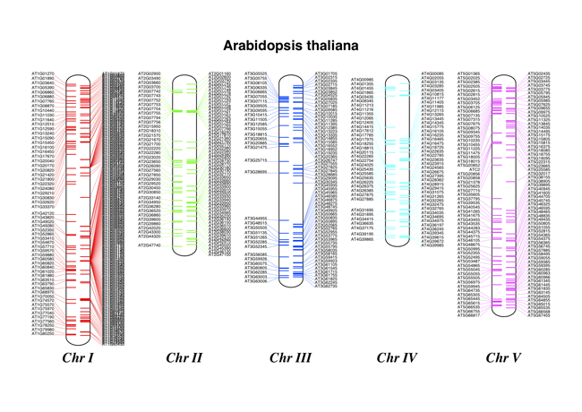
Fig. 21 Chromosome diagram for Arabidopsis thaliana showing tRNA genes.
Continuing from the previous example, let’s also show the tRNA genes. We’ll get their locations by parsing the GenBank files for the five Arabidopsis thaliana chromosomes. You’ll need to download these files from the NCBI FTP site ftp://ftp.ncbi.nlm.nih.gov/genomes/archive/old_refseq/Arabidopsis_thaliana/, and preserve the subdirectory names or edit the paths below:
from reportlab.lib.units import cm
from Bio import SeqIO
from Bio.Graphics import BasicChromosome

entries = [
    ("Chr I", "CHR_I/NC_003070.gbk"),
    ("Chr II", "CHR_II/NC_003071.gbk"),
    ("Chr III", "CHR_III/NC_003074.gbk"),
    ("Chr IV", "CHR_IV/NC_003075.gbk"),
    ("Chr V", "CHR_V/NC_003076.gbk"),
]

max_len = 30432563  # Could compute this from the entries dict
telomere_length = 1000000  # For illustration

chr_diagram = BasicChromosome.Organism()
chr_diagram.page_size = (29.7 * cm, 21 * cm)  # A4 landscape

for index, (name, filename) in enumerate(entries):
    record = SeqIO.read(filename, "genbank")
    length = len(record)
    features = [f for f in record.features if f.type == "tRNA"]
    # Record an Artemis style integer color in the feature's qualifiers,
    # 1 = Black, 2 = Red, 3 = Green, 4 = blue, 5 =cyan, 6 = purple
    for f in features:
        f.qualifiers["color"] = [index + 2]

    cur_chromosome = BasicChromosome.Chromosome(name)
    # Set the scale to the MAXIMUM length plus the two telomeres in bp,
    # want the same scale used on all five chromosomes so they can be
    # compared to each other
    cur_chromosome.scale_num = max_len + 2 * telomere_length

    # Add an opening telomere
    start = BasicChromosome.TelomereSegment()
    start.scale = telomere_length
    cur_chromosome.add(start)

    # Add a body - again using bp as the scale length here.
    body = BasicChromosome.AnnotatedChromosomeSegment(length, features)
    body.scale = length
    cur_chromosome.add(body)

    # Add a closing telomere
    end = BasicChromosome.TelomereSegment(inverted=True)
    end.scale = telomere_length
    cur_chromosome.add(end)

    # This chromosome is done
    chr_diagram.add(cur_chromosome)

chr_diagram.draw("tRNA_chrom.pdf", "Arabidopsis thaliana")
It might warn you about the labels being too close together - have a look at the forward strand (right hand side) of Chr I, but it should create a colorful PDF file, shown in Fig. 21.